Brand Assets
The learn.place identity, in one place.
Logos, the mark, favicons, and color values. With light and dark usage rules that keep the brand the same across the site and the apps.
Wordmark
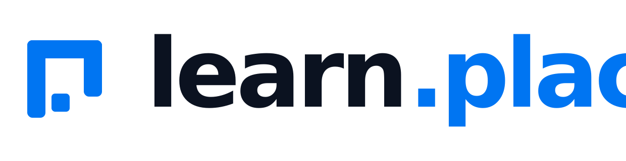
The mark, then “learn” and “.place” in brand blue. Use the light version on light surfaces and the dark version on the dark theme.
The mark
An open square with the “L” read out of the negative space. Drawn with currentColor, so it takes the accent on light grounds and a lighter blue or white on dark.
Below 20px the bare mark stops being legible, so use the tiled favicon instead.
Left: minimum clear space, equal to the mark’s top-bar height on every side. Right: the mark holds its shape down to ~24px.
Favicon & app tile
Bare marks disappear at small sizes, so the favicon always uses the tiled version: a blue 256×256 tile with the mark knocked out in white. Browsers take the SVG; because Google's search results do not accept SVG, 16/32/48 PNGs and a multi-size .ico are served alongside it.
Color
One accent: electric blue, nudged a little darker in light mode so white button text passes WCAG AA. Everything else is a low-saturation cool grey. Click a value to copy it.
Accent is for emphasis only: primary buttons, links, the focus ring, the mark. Not for painting a neutral surface.
Usage
A few rules keep the mark recognizable. When in doubt: more space, flat accent blue.
- 01One accent. No purple gradients, no neon glow, no second accent color.
- 02Light and dark pairs. Blue mark and dark text on light. Lighter blue (#3C91FD) and white text on dark.
- 03Clear space. Leave at least the mark’s top-bar height clear on every side.
- 04Small sizes. Below 20px, use the tiled favicon instead of the bare mark.
Download
Logos, the mark, and light/dark favicons, in one zip.
learn.place asset pack
SVG source for every logo and mark, plus the tiled favicon and PNG exports. Vector, theme-ready. Click any file to download it on its own.